Style Guide

How to Use Color Theory to Build Better Outfits

Use color theory to build better outfits with easy palette formulas, accent strategies, and combinations that move beyond basic neutrals.

Article summary

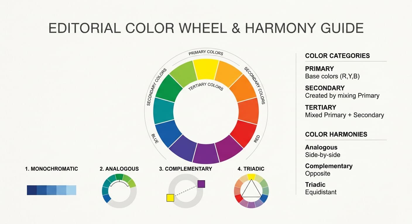
  • Use a few practical color harmonies to make outfit building feel more intentional instead of more complicated.
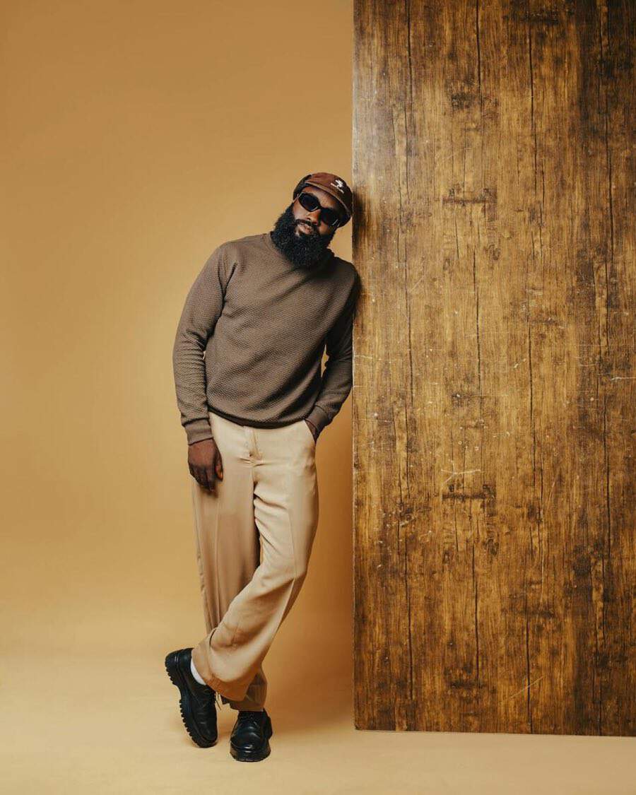
  • Treat neutrals and denim as the stabilizing layer that lets stronger colors work without chaos.
  • Use one accent color at a time when you want energy, then adjust intensity through shade and texture.
  • Build from starter palettes you can actually repeat rather than relying on random colorful purchases.
Color-balanced outfit with rich neutrals and one intentional accent

Start with the small part of color theory that actually helps

Most people do not need a full art-school lesson to get dressed. They need a simpler way to understand why one outfit feels cohesive and another feels accidental. Color theory helps because it gives names to relationships you already respond to instinctively. Once you know the basic logic, you can repeat it on purpose.

The useful part starts with the wheel. Primary colors are red, blue, and yellow. Secondary colors are orange, green, and purple. Tertiary colors sit between them. More important than memorizing the chart is understanding what it shows you: colors can echo one another, sit beside one another, or create deliberate contrast. That is what outfit building runs on.

This also explains why color can feel intimidating in the closet. Without a framework, every bright or unusual piece feels like a test. With a framework, a color becomes less of a gamble and more of a styling choice. You are not asking whether the item is interesting. You are asking what role it is going to play in the outfit.

Editorial color wheel graphic showing primary, secondary, and tertiary colors with harmony labels

Color wheel graphic showing primary, secondary, and tertiary colors

Use a few repeatable color harmonies instead of memorizing every rule

The easiest way to use color well is to narrow the number of relationships you rely on. Most strong everyday outfits fall into a handful of categories: monochromatic, tonal, analogous, complementary, or a neutral base with one accent. That covers far more ground than most wardrobes need.

The reason this matters is that different harmonies create different moods. Tonal outfits feel calm and polished. Complementary color creates energy. Analogous dressing usually feels softer and more blended. Once you understand the effect, you can choose the one that supports the outfit instead of defaulting to whatever happens to be clean.

Women wearing a brown monochrome outift

Monochrome outfits work well when there is consistency from both color and texture

Photo by cottonbro studio on Pexels

Monochrome and tonal outfits are the easiest way to look intentional

Monochrome means staying inside one color family. Tonal means using neighboring shades of similar depth or temperature. In practice, these are the most wearable because they feel composed without demanding too much contrast. Navy with cobalt and pale blue works. Olive with moss and khaki works. Chocolate with camel and cream works.

Texture is what keeps these outfits from feeling flat. A matte knit, crisp cotton shirt, soft trouser, and polished leather shoe can all sit in the same family without becoming dull. This is why tonal dressing often looks more expensive than it is. The eye reads depth even when the color story stays narrow.

Complementary and analogous color are better when you control the intensity

Complementary colors sit opposite each other, like blue and orange or red and green. In fashion, they usually work best when one side is toned down. Burgundy and olive are easier than bright red and grass green. Dusty blue with rust is easier than cobalt with neon orange. The same relationship is there, but the outfit feels mature instead of costume-like.

Analogous colors sit next to one another on the wheel, such as blue, teal, and green. They work well when you want more movement than a tonal outfit but still want a soft transition between colors. A forest trouser, teal knit, and navy jacket usually feel coherent because the shift is gradual.

Neutrals make color easier to wear

The strongest argument for neutrals is not that they are safe. It is that they make experimentation easier. White, cream, black, grey, navy, olive, camel, brown, and denim give bright or unusual colors something to land on. They are the part of the outfit that creates order.

This is also why wardrobes full of random color often feel harder to use than wardrobes built around a steady neutral base. If each colorful item requires its own special pairing, the closet becomes high-maintenance. If the core is stable, color becomes modular. You can swap one top, bag, or shoe and change the mood without rebuilding the whole outfit.

Outfit breakdown showing a neutral base with one accent color

Neutral bases can work in a variety of settings ranging from casual to more elevated events

Photo by Alexy Almond on Pexels

Use one accent color when you want the outfit to wake up

A neutral outfit with one accent is often the cleanest way to get comfortable with color. Start with something grounded such as navy trousers, a white shirt, and black shoes. Then introduce one point of color through a knit, bag, scarf, or blouse. The accent reads clearly because nothing else is competing with it.

This approach works especially well if you are used to dressing in neutrals and want a bridge into more expressive combinations. It also makes shopping clearer. Instead of buying color randomly, you can choose one or two accent directions that work with the neutral foundation you already trust.

Curated Product Recommendations

Elevated

Kallmeyer

Elliot Chore Coat in Cotton Denim

Outerwear

Elliot Chore Coat in Cotton Denim
Designer

Feng Chen Wang

GRADIENT DENIM JACKET

Outerwear

GRADIENT DENIM JACKET

Texture changes the way color behaves

Color is not just hue. Surface changes it. Velvet deepens tone because it absorbs light differently. Crisp cotton can make a color look sharper. Brushed wool softens it. Satin throws more light back and often makes the same shade feel brighter or cooler than it would in a matte fabric.

This matters because people often think a color is wrong when the real issue is finish. A shiny cobalt blouse can feel much louder than a matte cobalt knit. An olive trouser in wool can feel richer than the same olive in technical nylon. Once you start noticing texture, it becomes easier to understand why some combinations feel balanced even when they are not strictly matching.

Editorial image showing how texture changes the way one color family reads

Color families don't just apply to neutral colors, they can also be applied to blues and reds

Photo by Muhammad Khawar Nazir on Pexels

Build from starter palettes you can repeat

Starter palettes are useful because they cut down decision fatigue. Instead of asking what works every morning, you work inside a family that already makes sense together. This does not limit creativity. It gives you a more stable base for it.

Three families are especially useful. Earth tones such as camel, olive, tan, and rust feel grounded and easy to layer. Cool tones such as navy, grey, cobalt, and silver feel clean and polished. Warm tones such as ivory, camel, rust, and burgundy feel softer and richer. None of these are rigid categories. They are repeatable starting points that make the closet more coherent.

Board with earth tones, cool tones, and warm tones

Board with earth tones, cool tones, and warm tones

Photo by cottonbro studio on Pexels

Treat palette building like outfit building, not mood boarding

A palette only matters if it produces outfits. Earth tones might mean a camel knit, olive trouser, brown loafer, and rust scarf. Cool tones might mean a navy jacket, grey trouser, and blue shirt. Warm tones might mean an ivory top, cinnamon trouser, and burgundy bag. The point is not the swatch itself. The point is whether you can wear it next week without effort.

This is where HiLo's wardrobe logic matters. You are not collecting appealing colors one by one. You are building combinations that help more pieces work together. When a palette can support multiple outfits, it earns its space in the closet.

Curated Product Recommendations

Elevated

KOTN

Women's Acacia Tie Boatneck Tee

Shirts

Women's Acacia Tie Boatneck Tee
Elevated

Eliza Faulkner

Romy Pant Maroon Red Linen

Trousers

Romy Pant Maroon Red Linen

Common Mistakes

Adding too many strong colors at once

Most outfits become easier when one color leads and the rest support it. Too many bright notes at equal volume usually create noise instead of intention.

Ignoring value and intensity

A pairing can look off even if the hues are technically compatible. Soft, muted versions often wear better than sharp, fully saturated ones in everyday outfits.

Treating neutrals as boring instead of structural

Neutrals are what allow color to work repeatedly. Without them, many colorful pieces become isolated and harder to style.

Matching too literally

Exact matches in every accessory or layer can make an outfit feel rigid. Shared color direction is usually more interesting than perfect duplication.

Practical Examples

Tonal blue for work

A navy jacket, blue shirt, washed denim, and dark loafer feel cohesive because the outfit stays inside one family but changes depth and texture.

Neutral plus one accent for weekends

Cream tee, olive trouser, black sandal, and one red or cobalt bag create enough energy without making the outfit harder to repeat.

Analogous color without drama

Forest, teal, and navy work well together because the color movement is gradual and the neutrals around them stay quiet.

Complementary color made wearable

Swap bright opposites for toned-down versions such as burgundy with olive or rust with dusty blue to keep the relationship while lowering the volume.

Product Call-Out Ideas

Easy accent-color entry points

  • bright knit
  • colored tee
  • printed scarf
  • statement bag
  • slingback shoe

Reliable neutrals for color-building

  • navy shirt
  • cream tee
  • olive trouser
  • black loafer
  • denim layer

Starter palette directions

  • earth tones
  • cool blues and greys
  • warm camel and rust
  • one-color tonal dressing

HiLo Takeaway

Color theory is useful because it helps you understand why an outfit works, not because it gives you more rules to obey.

Start with neutrals, add color with intention, and repeat the combinations that make getting dressed easier. That is how color becomes part of a cohesive wardrobe instead of a separate experiment.

FAQ

How do I start using color theory in outfits?

Start with one simple approach: a neutral base plus one accent color, or a tonal outfit inside one color family. Both are easy to repeat and hard to overdo.

Can you wear navy and black together?

Yes. Navy and black work especially well when the rest of the outfit is simple and the textures feel intentional. They usually look stronger together than people expect.

What is the easiest color combination to wear?

Tonal dressing is usually the easiest because it stays inside one family while still creating depth through different shades and textures.

How many colors should be in one outfit?

A good default is two neutrals and one stronger color, or several shades from one family. You can do more, but the outfit usually needs stronger structure to hold it together.

Does denim count as a neutral?

Usually yes. Blue denim often works like a neutral because it pairs easily with white, black, navy, olive, camel, and many accent colors.

Related Guides

Keep reading

View all guides

How to Build a Spring Wardrobe

Build a spring wardrobe with lighter layers, smart fabrics, and repeatable outfit formulas that handle weather swings without making your closet feel random.

How to Build a Summer Wardrobe

Build a summer wardrobe with breathable fabrics, relaxed silhouettes, and polished outfit formulas that work in heat and humidity.